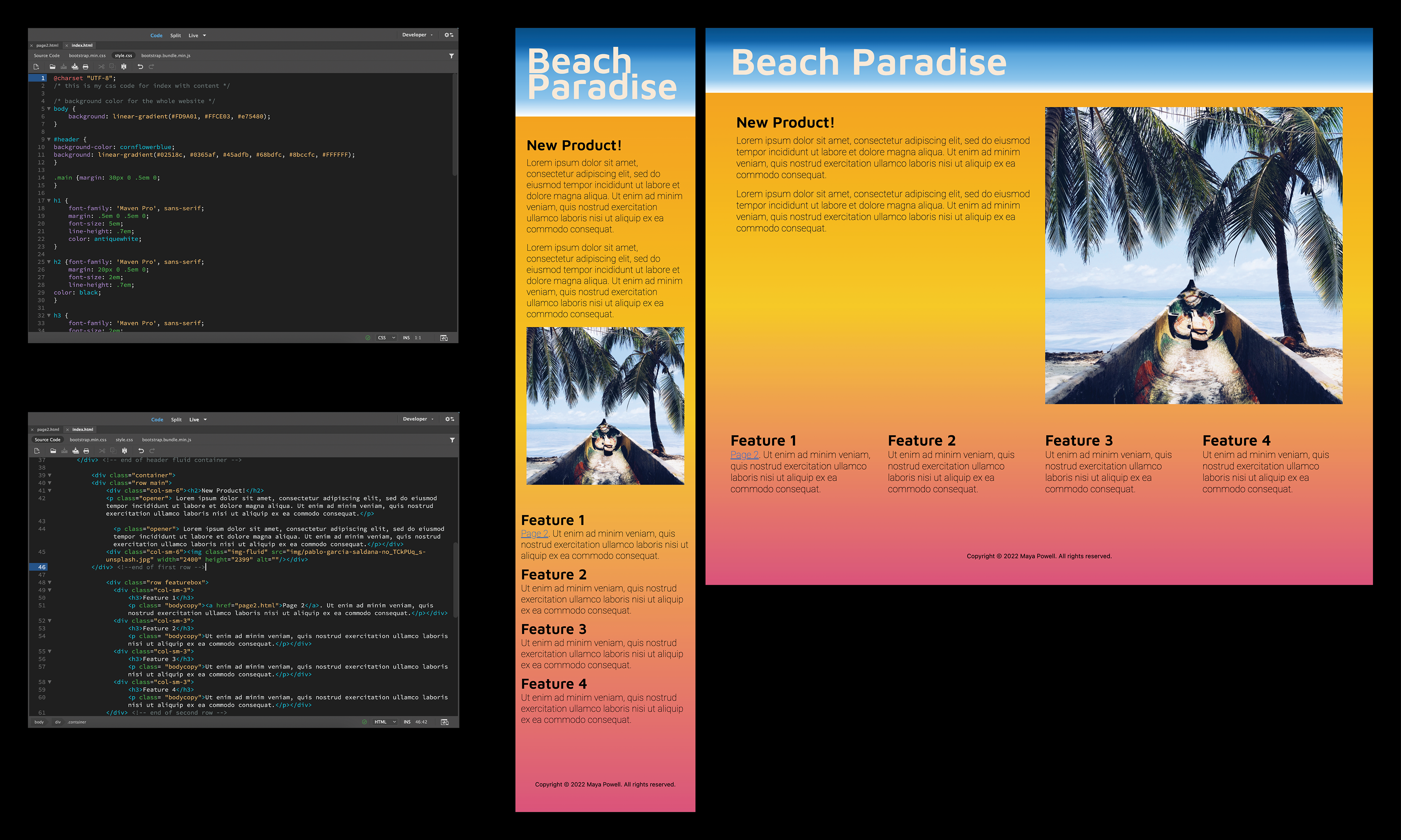
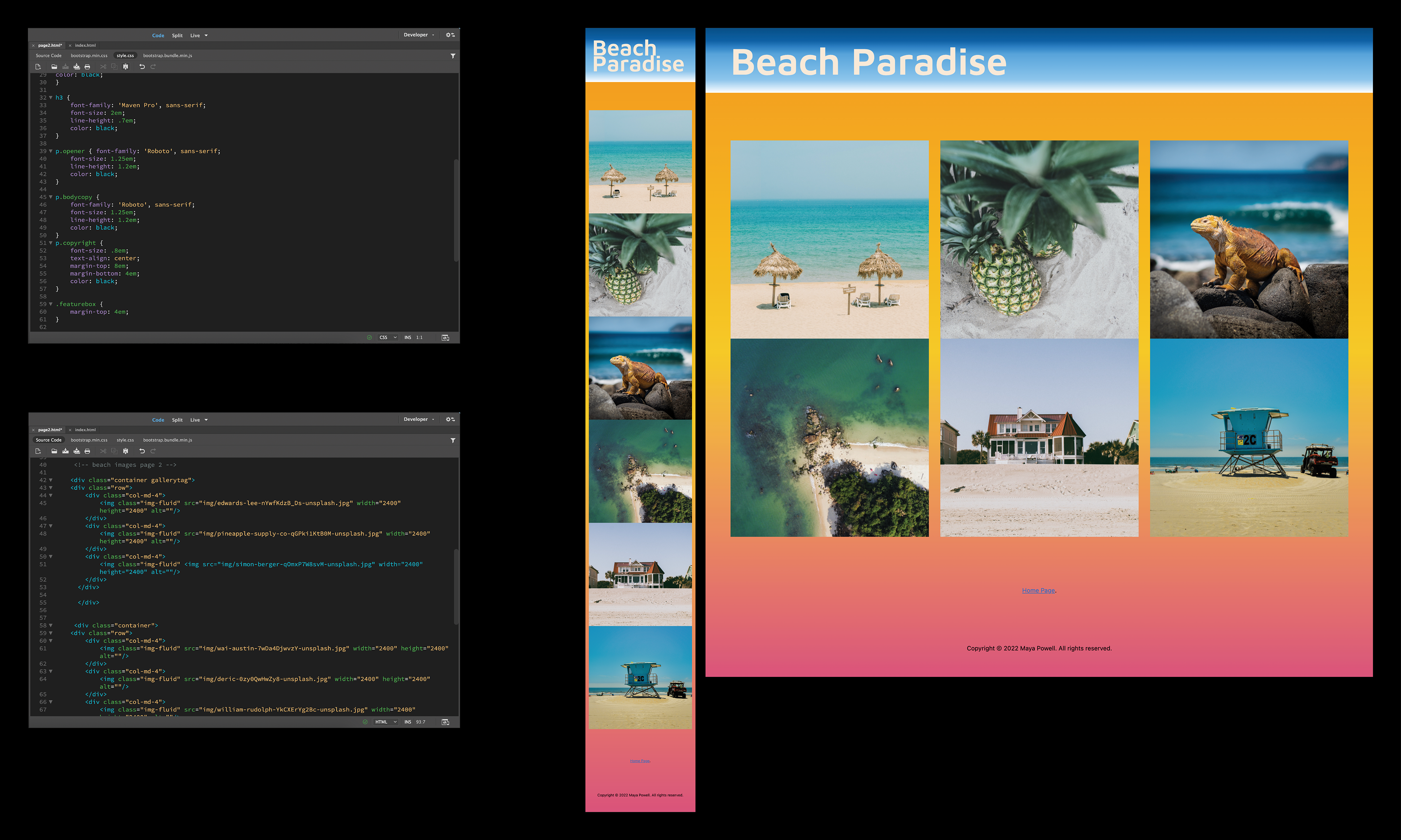
Project #3: Responsive Web Design intro Grids & RWD Concepts
For this project, I descended into the world of coding! I began this process by using an open-source Bootstrap grid framework to customize two page layouts: one as a typical desktop display, and the other as a mobile display device. The software I used to code was in Adobe Dreamweaver , where I tampered with the HTML wireframes and CSS wireframes for both display devices. The final presentation boards below showcases screenshots of the code work (on the left) that created the websites on both devices (on the right).
Some of the changes that I made include: two gradients, two typefaces, placement of the heading, subheading and body copy, an image, the footer, and a link to page 2 and the home page. This was definitely a challenging project because you have to make sure everything you type in the code is perfectly written with the correct code symbols, as well as a lot of trial and error.
Photo credentials from Unsplash include: Pablo Garcia Saldana, Edwards Lee, Pineapple Supply Co., Deric, William Rudolph, Was Austin, and Simon Berger.
