Project #4: Accessibility & SEO Concepts
For this project, I researched two different websites and used Google's build-in attribute Lighthouse as well as an extension called WAVE to locate any Accessibility and SEO issues. The goal was to come up with solutions to the issues with both Accessibility and SEO within each mobile website and to showcase the "before" and "after" of each change.
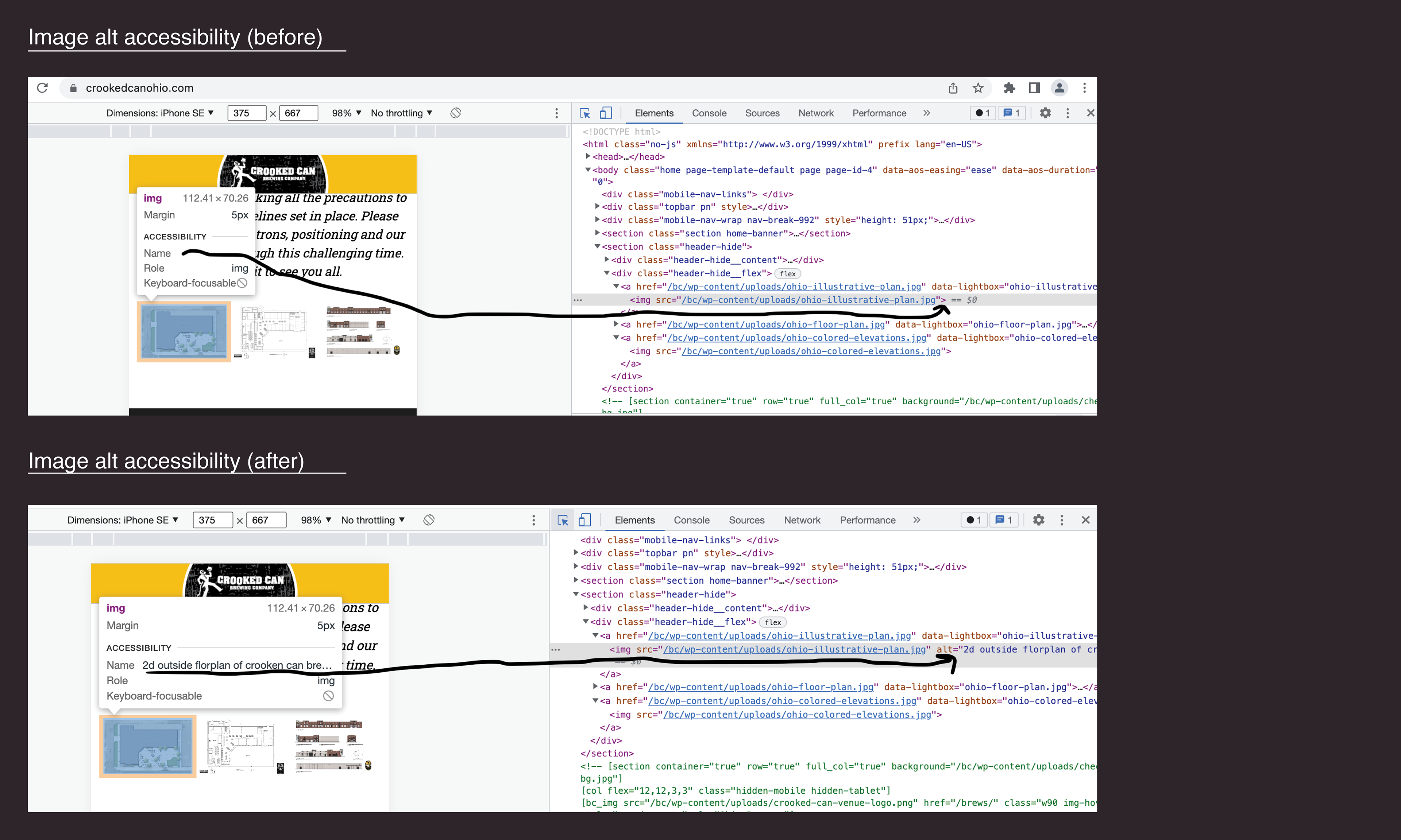
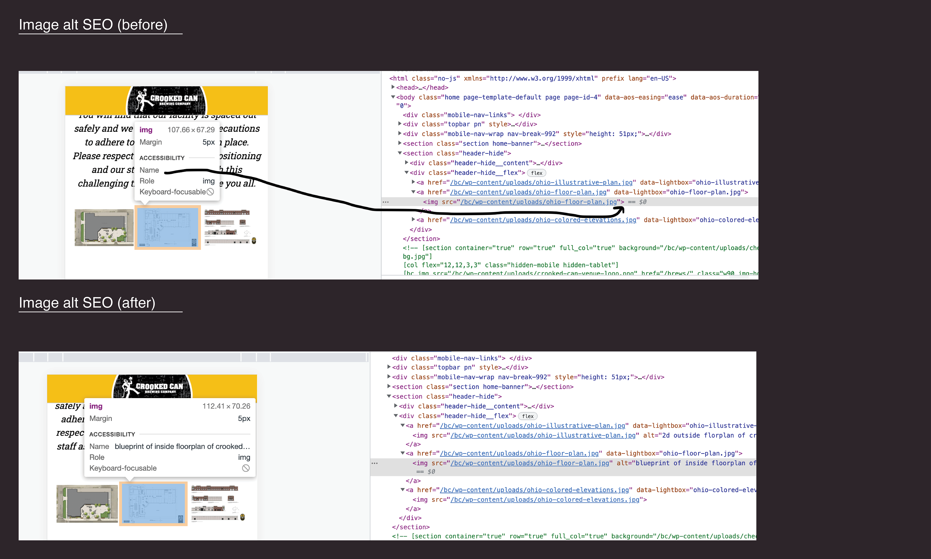
The first website I found is called The Crooked Can Brewery which is located in Hilliard, Ohio. This website contained a rating of 64 (accessibility issues) and 86 (SEO issues). Below I have shown a before and after screenshot of their website, although this project only required us to make 4 total changes to the site, so therefore, there isn't a big noticeable change with the (before) and (after) with these screenshots.
The image alt issue is that there is no description with the images on their website, so the solution is to go into the code and write a description for each image for user to read. I have added descriptions to each of these three images that show the user what each image will provide.
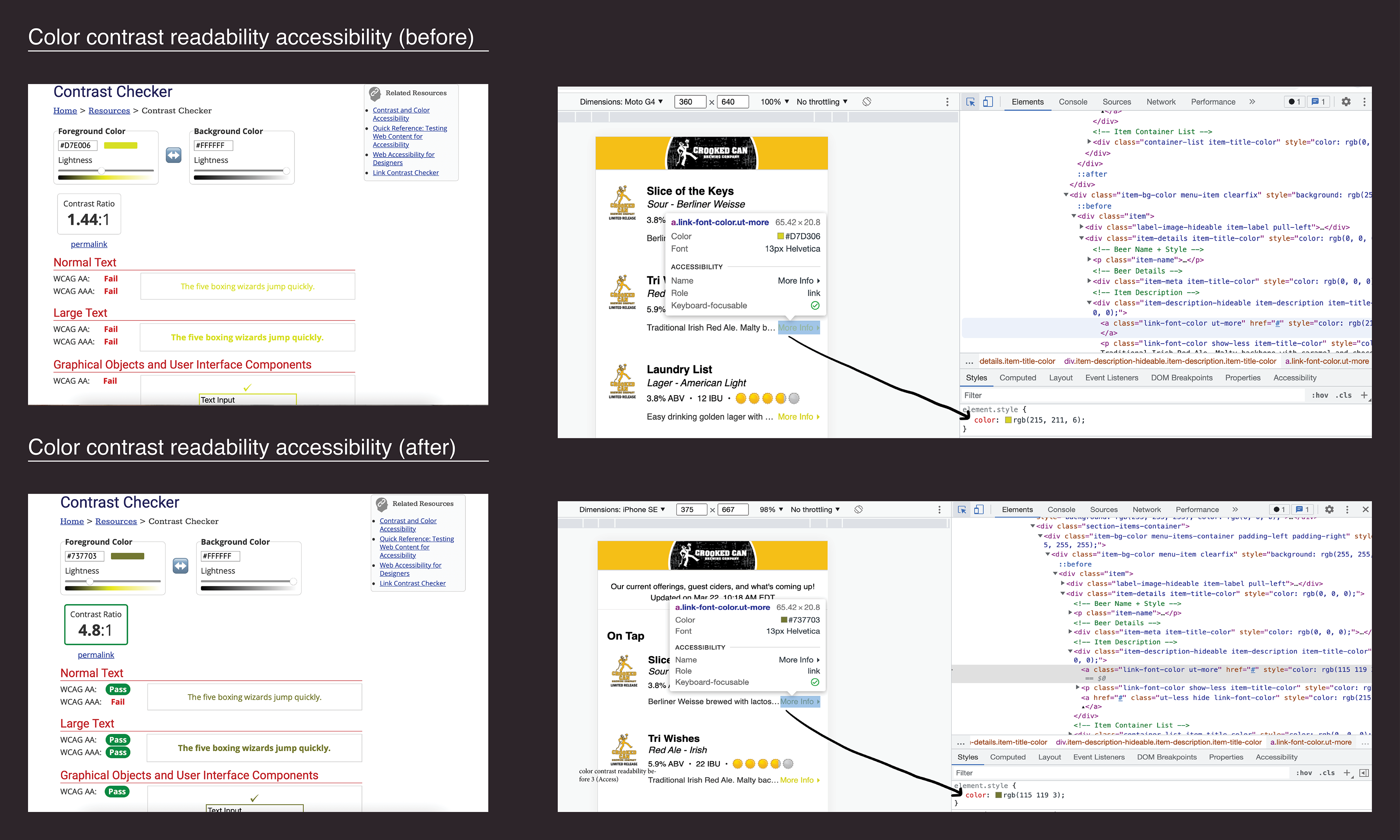
The issue with this bright yellow color is that it makes it very hard to read on screen, so using Google's WEB AIM Color Contrast Checker, I have shifted the color to a darker yellow that will pass the readability standard. Reference the fail (before) and pass (after) for the solution.
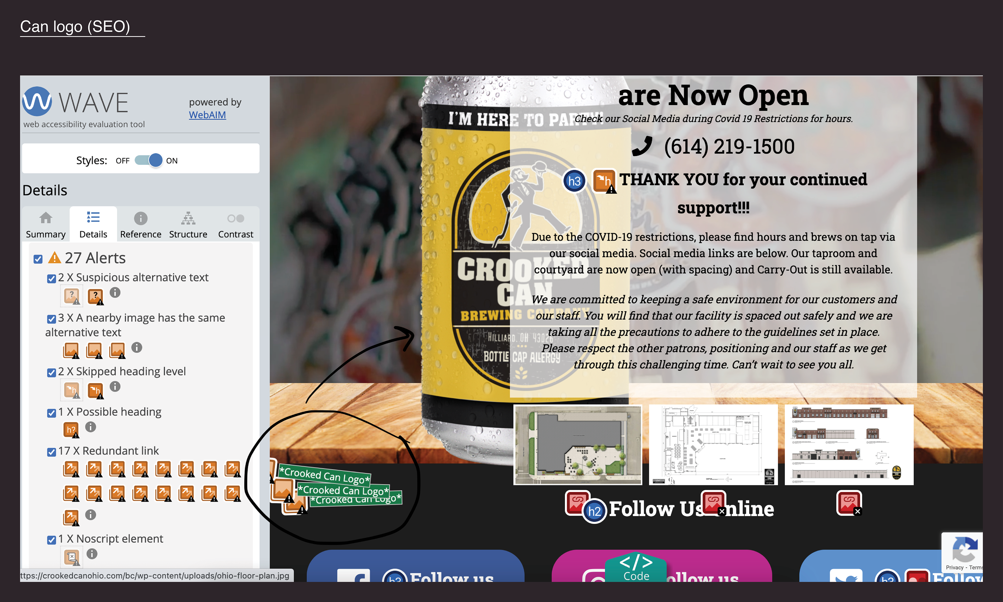
the Crooked Can Brewery logo has three images that contain its logo, one that is a still image, and the other three that are moving (animated) images on the can. When going about this change I would type in alt="" not needed for decorative image.
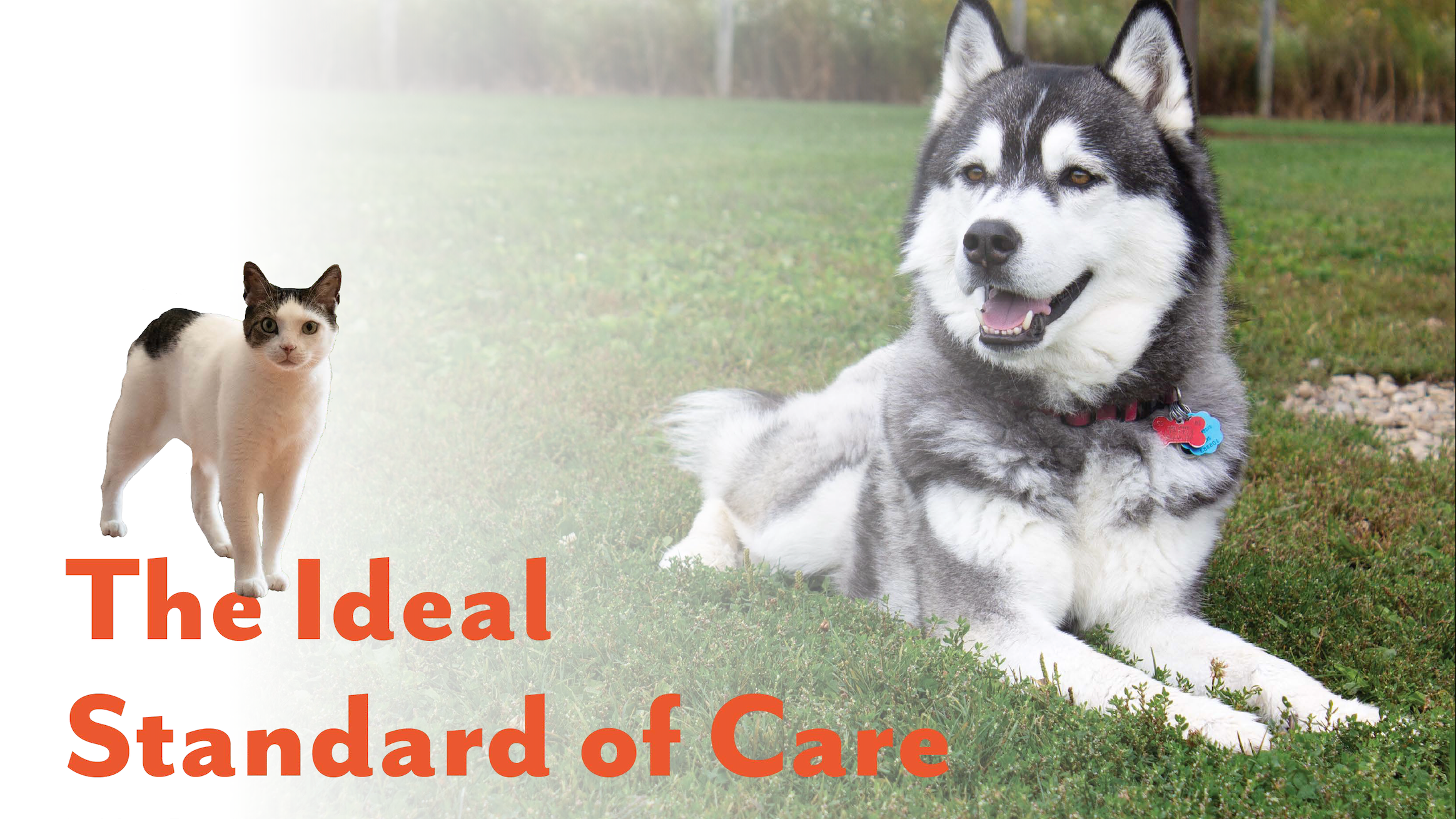
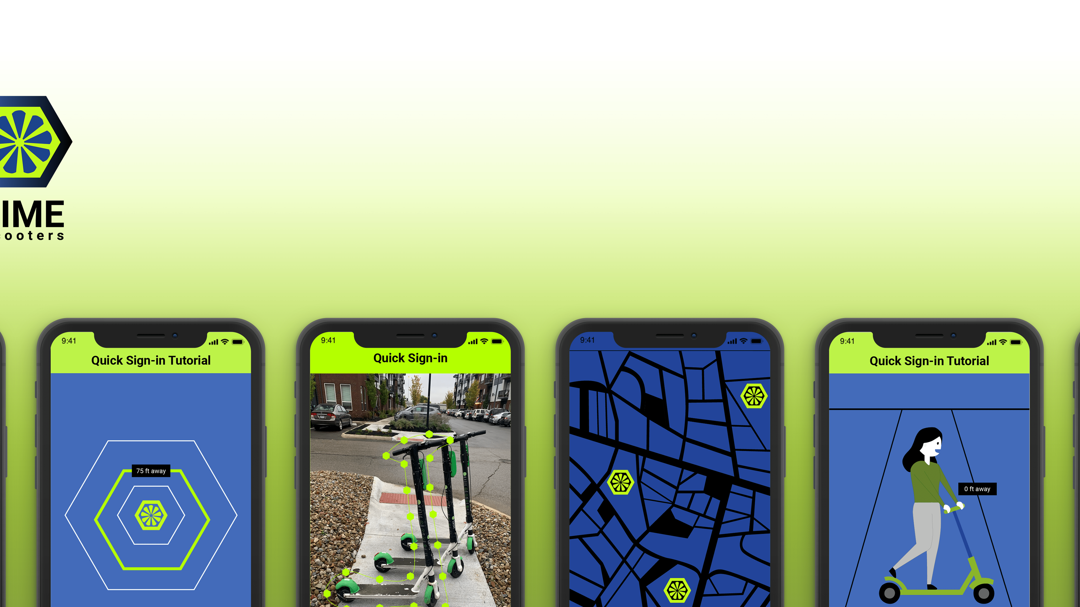
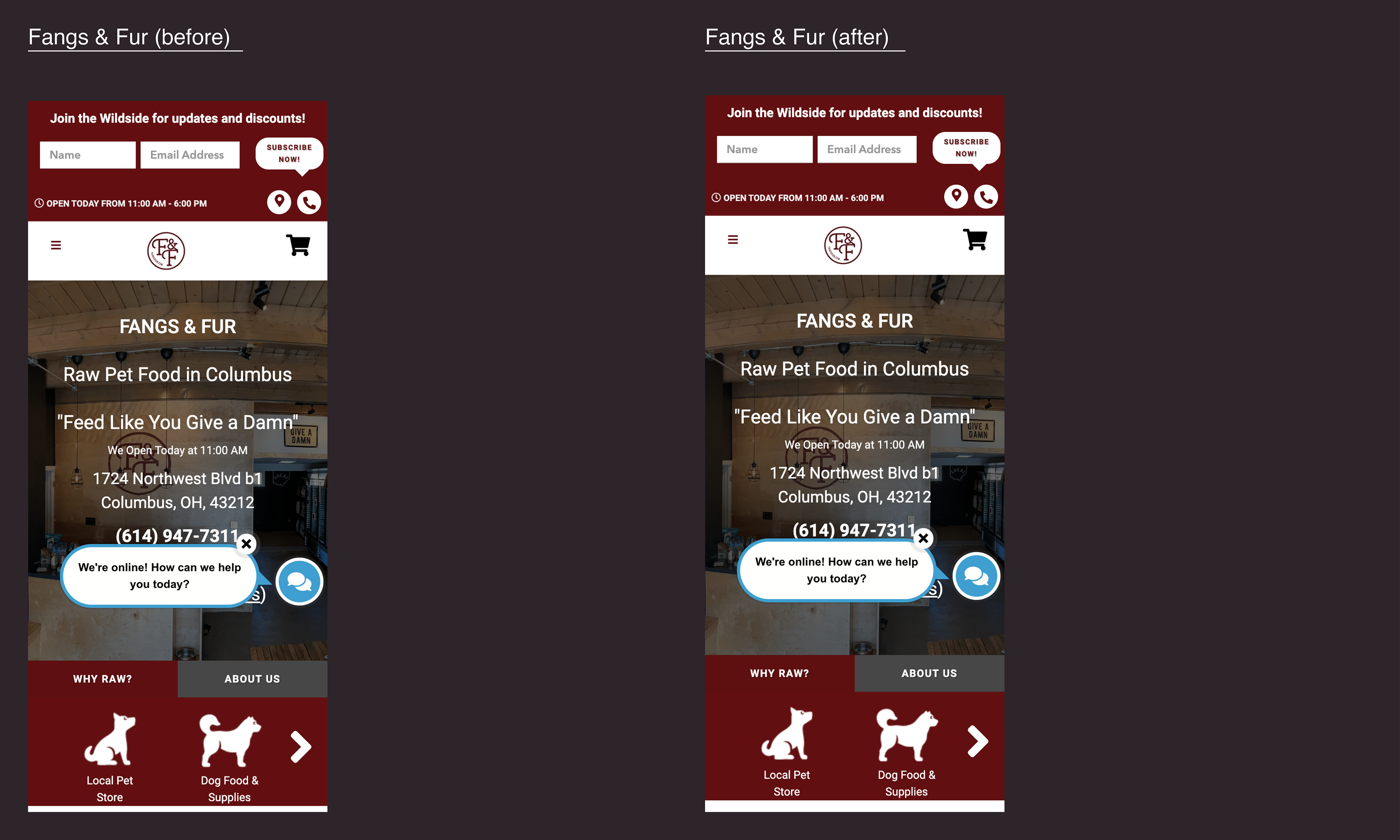
The second website I found is called Fangs & Fur: Pet Food Supply Store which is located in Columbus, Ohio. This website contained a rating of 76 (accessibility issues) and 85 (SEO issues). Below I have shown a before and after screenshot of their website, as again, there isn't a big noticeable change with the (before) and (after) with these screenshots.
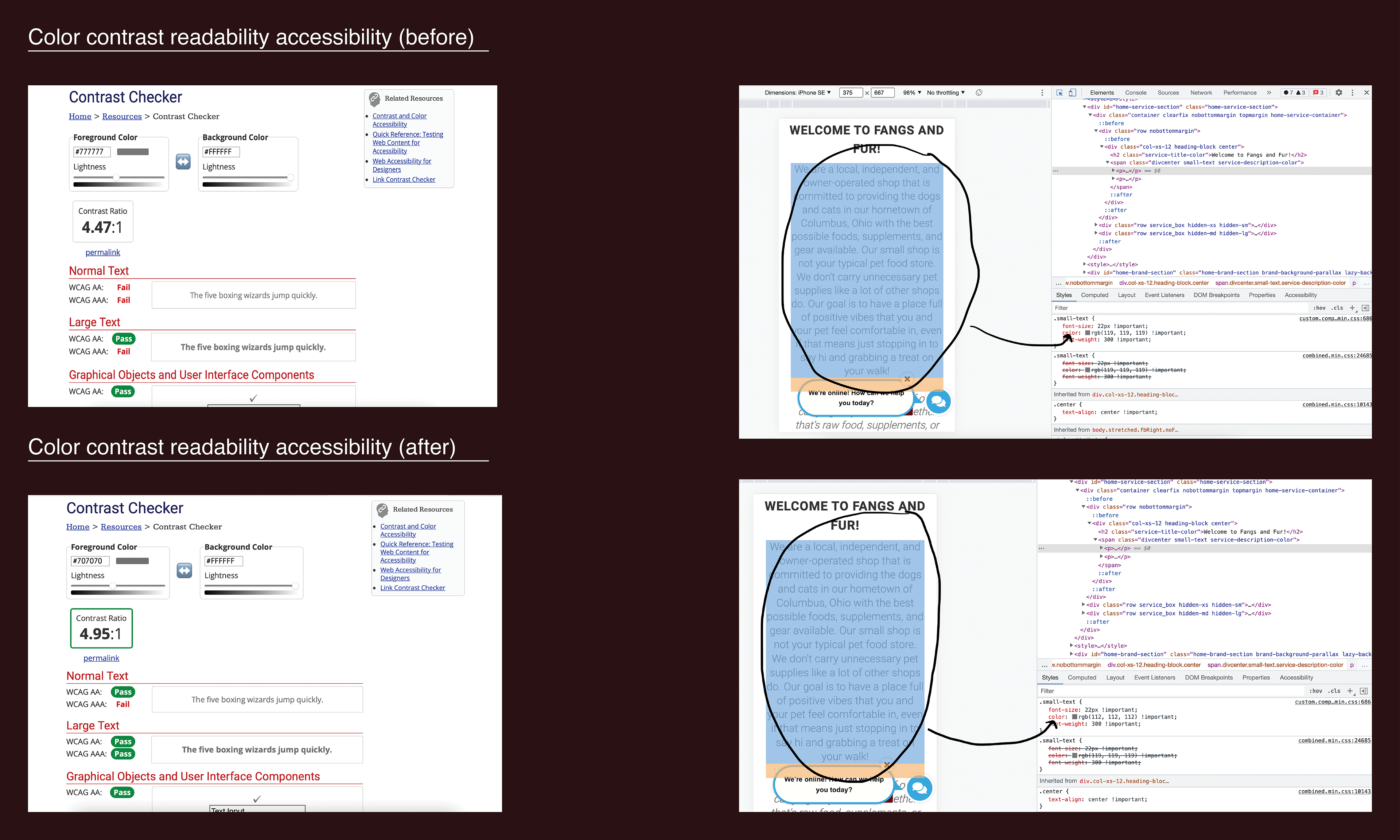
The issue with this grey color is that it makes it very hard to read on screen, so using Google's WEB AIM Color Contrast Checker, I have shifted the color to a darker grey that will pass the readability standard. Reference the fail (before) and pass (after) for the solution.
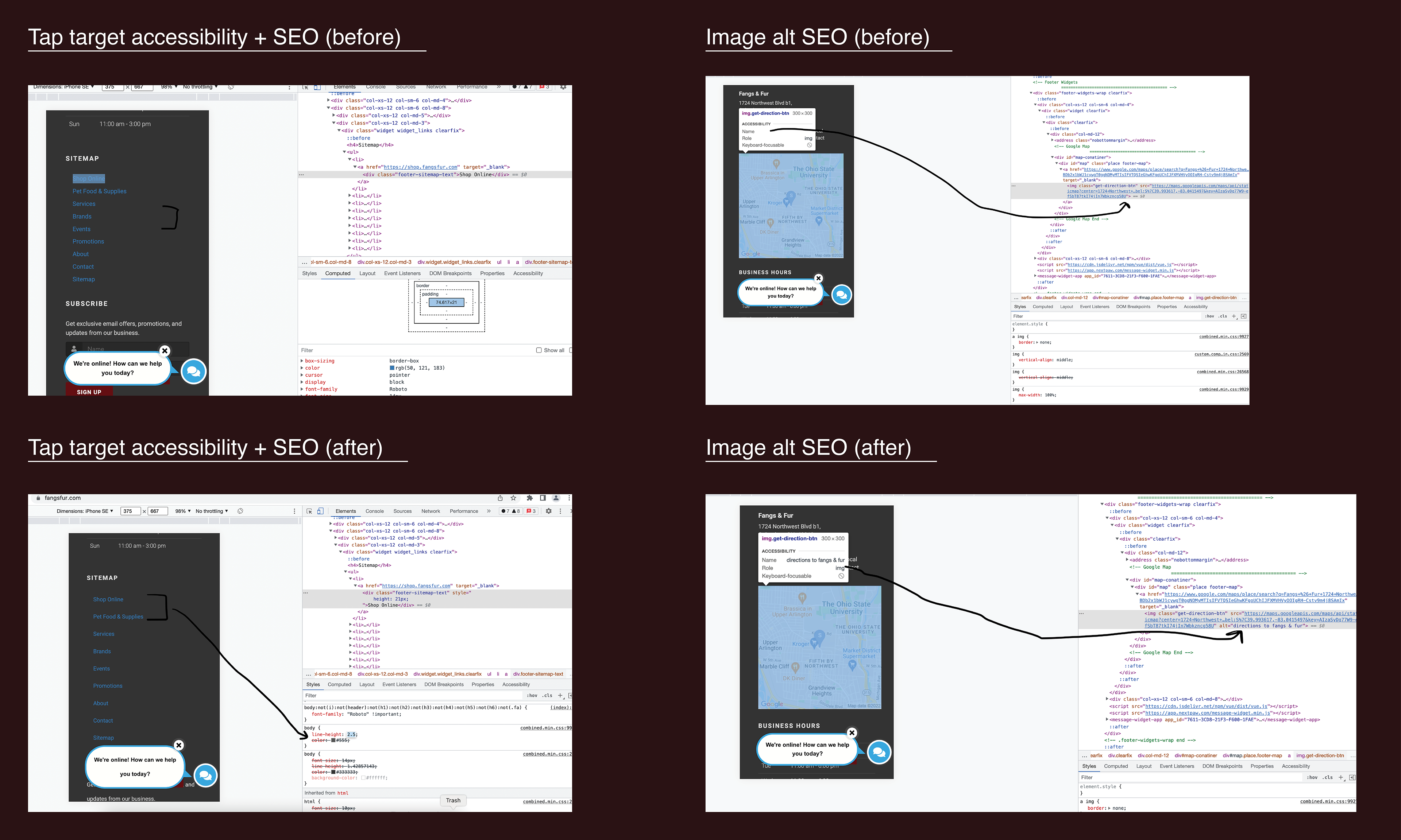
The tap target issue in this instance is that the words under the word "sitemap" are too close together which will make it harder for the user to touch which link they would like to access. The solution is to add more space between each link.
The image alt issue is that there is no description with the map on their website, so the solution is to go into the code and write a description for the user to read. In this case, the user will want to know what purpose this map is for.
With this tap target icon, there was an issue with the title location description. When making this change, you would initially want to add a title attribute and be very specific with the description to allow the reader to understand what they are clicking on. What I would name this icon would be "find my location".